How does UI/UX affect conversion and engagement rates and how can you optimise?
Shanuj Mishra
5 Apr 2019
•
4 min read
When a user visits your website, you have just 3–5 seconds to leave an impression on his/her mind. Do you think that’s a whole lot of time? Definitely Not! But believe me, that’s all the time you have. The user will become your future customer or not depends upon the experience you provide through your website in these 3–5 seconds.
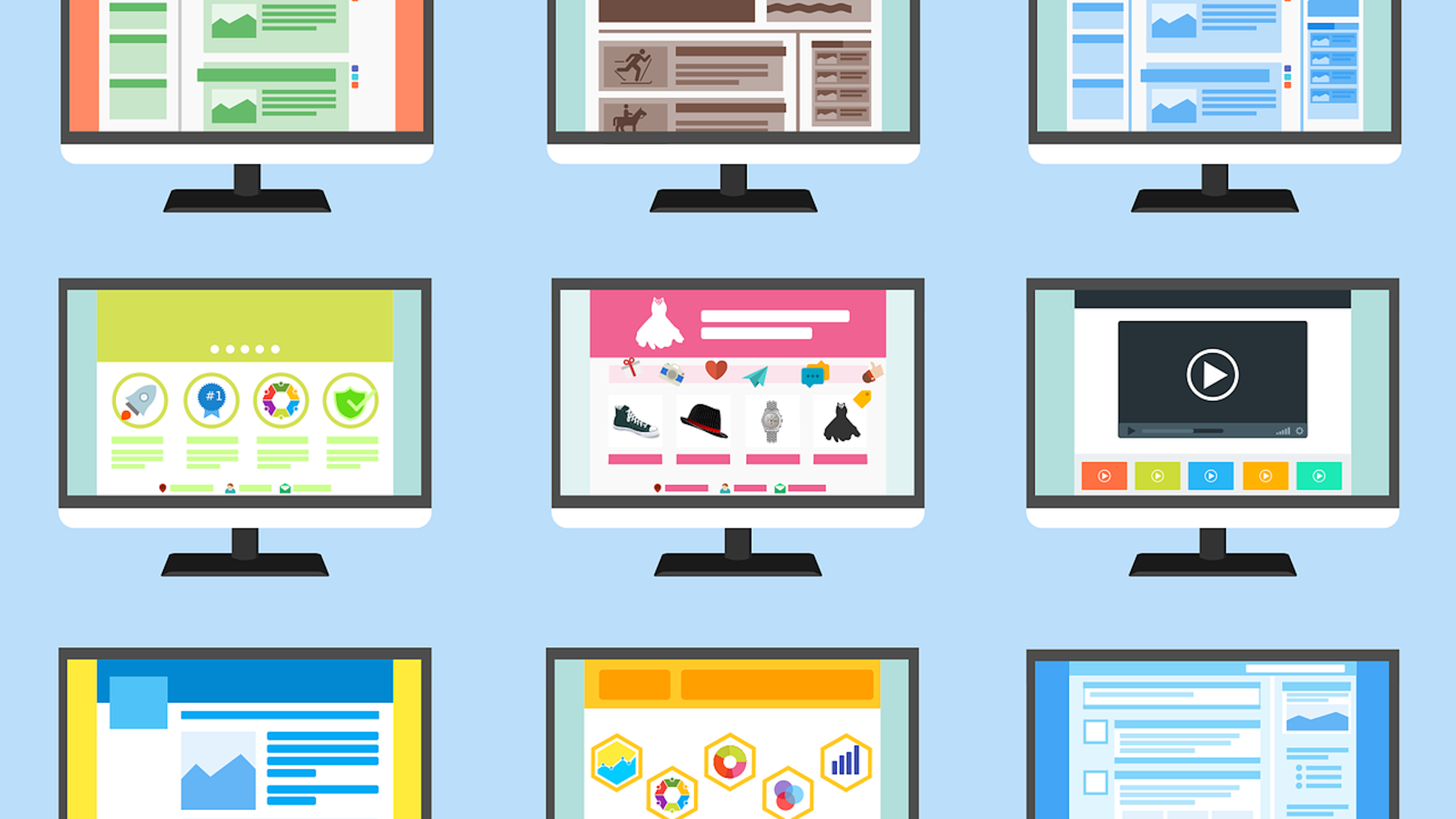
In today’s fast-growing digital marketing scenario, the most powerful tool that you have is your website. It’s a core anchor for your digital marketing and acts as a salesman 24/7. Compromising on your website design means compromising on your business.
Designing a great website requires deep research and a thorough understanding of all the problems a user could face while navigating your website. While a poor UX design can confuse & frustrate visitors and make your business suffer big time, a seamless and intuitive user experience can substantially increase the conversion and engagement rate.
However, the marketing field is very dynamic and new trends can make your website look old and outdated anytime, leaving you with low conversion and engagement rate. A complete redesign may seem like the only option, but it requires a lot of time and money to invest in. Nevertheless, there are other ways too through which you can provide great user experience (UX) to your visitors and enjoy higher conversion and engagement rates. Some of them are briefly listed below:
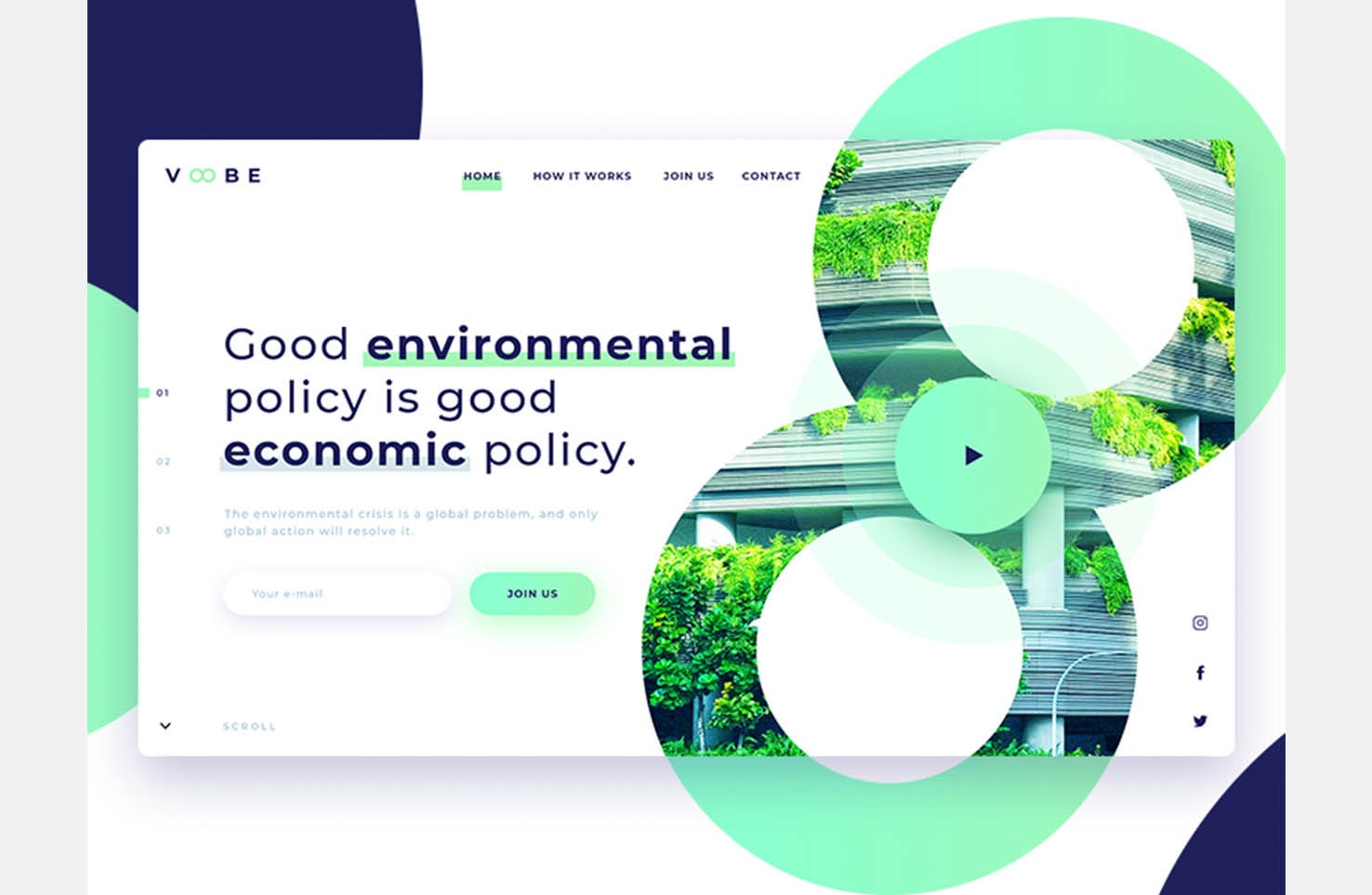
Appealing and Clear Call-to-Action
When it comes to providing quality user experience to visitors, call-to-action (CTA) buttons play a major role. Conversion, engagement, business, revenue, and profits of your business solely depend on the call-to-action button you provide throughout your website. CTA along with specific color can be a game changer. Studies prove that CTA buttons with orange, red and green color are more likely to be clicked by the visitors.
Writing catchy and actionable words on CTA buttons like Explore, Start, Discover etc can further excite customers. So, be clear while choosing the words for your button, they should be clear, bold and action-oriented.
Efficient Use of White Spaces
What if I tell you white space or negative space of your website helps you to achieve a great website design. Yes, that’s true! In spite of being one of the most important aspects of website design, it’s still so underrated.
According to researchers, white space around text and titles increases user attention and provides a better user experience. White spaces make your content more legible and easy to navigate. However, you need to balance the use of white spaces with important information.
White space is not merely a blank space, it’s a part of website design that allows the object to exist on the Webpage. It also guides visitors to navigate from one object on the page to another.
Use Bullet Points
By using bullet points on your website you are allowing visitors to easily gather the information they are looking for. It makes a large piece of content to appear more reader-friendly and also helps in grabbing the user’s attention.
While designing or redesigning a website it’s important to keep your content user-friendly and easily digestible by the visitors. While a large piece of text can be boring for most of the users, using bullet points can help you ensure that the content is actually being read and not just skimped through. It also makes your website more attractive and users can easily navigate to the required information.
Optimize Page Speed for Lower Bounce Rate
As I mentioned earlier you have just 3–5 second to impress a visitor. But what if your website itself takes 10 seconds to load on customer’s end? Obviously, the customer will get frustrated of waiting and look for some other site (your competitors). So, in order to give great user experience to your visitors, it’s essential to have a well-optimized website.
Optimizing website content, reducing HTML & CSS scripts, evaluating plug-ins are some ways to improve the speed of the website. Moreover, there are several online tools available to optimize your website loading time. Compressor.io and NGINX are among the options you can use to increase the efficiency of your website.
Choose Colour Wisely
In order to make your website more appealing and increase the visitor span of attention, it is important to choose the right colour combination throughout your website. Studies say that choosing the right colour scheme on your website reflects positivity and engages users for a much longer time. Studies show about 60% of acceptance or rejection of a website depends on this factor.
The colour combination you use in your website should match with the product and services you are offering. Like, if you are selling an environmental or health-related product, green would be much appropriate colour instead of red, orange, pink or any other.
Stay Consistent Throughout The Website
Consistency is a key requirement to design a user-friendly website and is what separates a good website from a bad one. It allows visitors to find a common element throughout the website. From heading size, font size and image choice to illustration style, button style and coloring, you should maintain consistency in each and every element on the website to ensure a rich user experience which in return would benefit your business.
Never Forget The Power of Images & Visuals
Who doesn’t like visuals — be it graphics, Gifs, images, animation or anything? From a-10-year old kid to a 60-year-old person everyone likes amazing visuals. Visuals on websites are more engaging than a big chunk of text, no matter how creative it is.
Statistics prove that users spend 10% more time on visuals than reading a text. Moreover, visuals attract customers and compel them to follow your call-to-action. There are several stock-photo websites available online which you can use to fire up your website and increase engagement rates. Some of them are listed below.
www.canva.com www.stocksnap.io www.pixabay.com www.unsplash.com
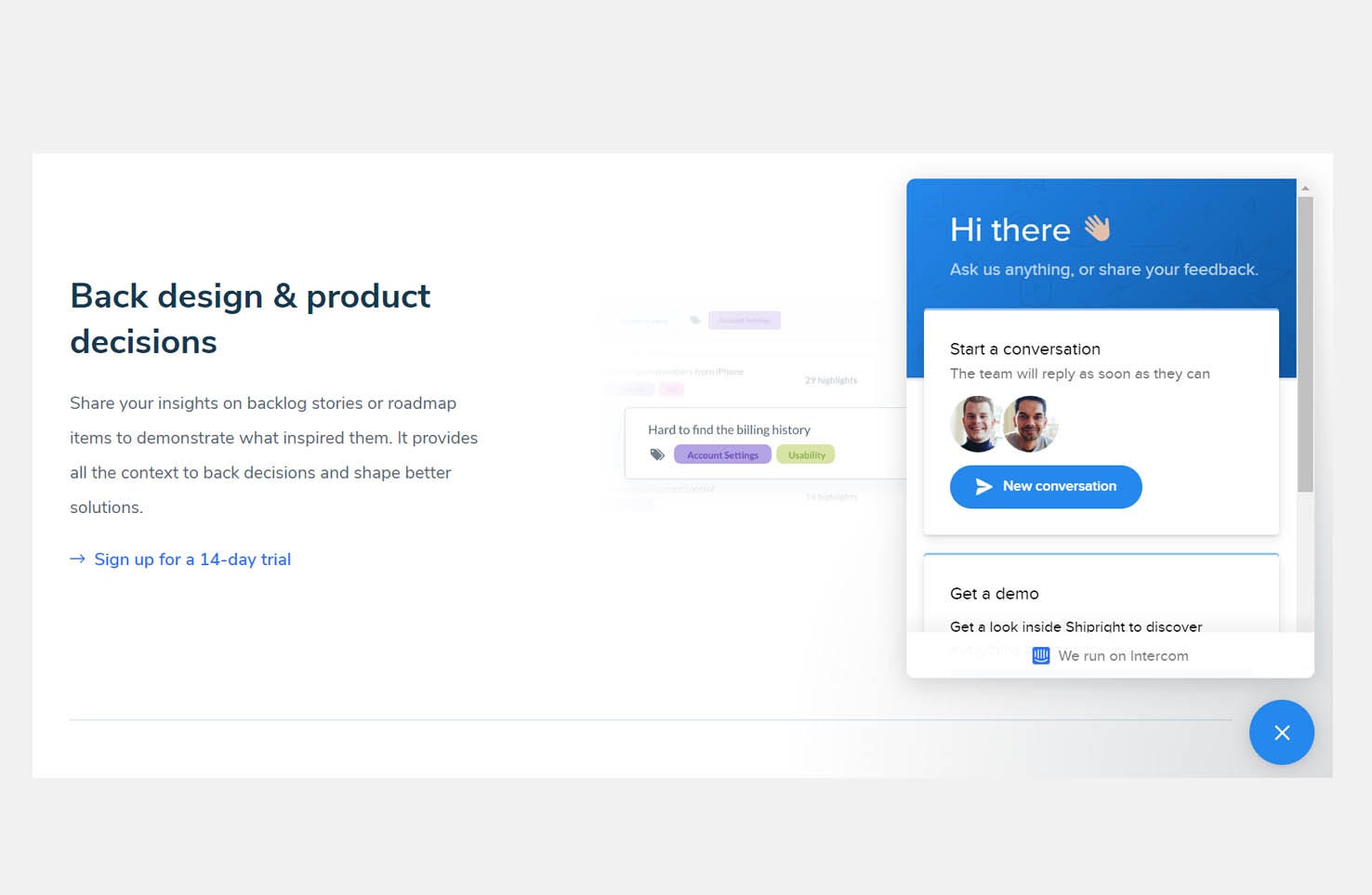
Add a chat box
Adding a chat box on your website allows your visitors to seek help anytime they find any issue. But be careful, an obtrusive chat box can frustrate customers and make them leave your website. You can add a picture and name to bring life to your chat box and make users feel they are talking to a real human.
WorksHub
Jobs
Locations
Articles
Ground Floor, Verse Building, 18 Brunswick Place, London, N1 6DZ
108 E 16th Street, New York, NY 10003
Subscribe to our newsletter
Join over 111,000 others and get access to exclusive content, job opportunities and more!