Using Material UI with React Apps: Getting started with Material UI
Damilola Adedoyin Ezekiel
23 Jun 2021
•
4 min read
Introduction
Material-UI is an open-source project that features React components and implement Google’s Material Design. It is one of the most popular frameworks for building React apps. It has a lot of awesome features that make it easy to build react apps. The material UI documentation is one of the best documentation I've ever gone through because of how user and beginner friendly it is. It is quite similar to Bootstrap but it has other advantages which is that it is easy to customise and it aids speed in development. In this article I'll be sharing the basics on how to get started with Material UI
Prerequisite
- Install the Material-UI snippet from vscode extension marketplace if you use vscode as this will make your work faster. Here's the link.
- Know how to to create react apps
Installation
There are two ways to install material UI. You can either install it as an npm package or CDN. We'll be installing it as an npm package in the article.
- First, you have to create your react app.
npx create-react-app material-ui-test
- then you run the command below in order to install material UI.
npm install @material-ui/core
npm install @material-ui/lab
npm install @material-ui/icons
- After running this command, you should see material UI among your dependencies in your package.json file.
Components in Material UI
Container
The container is the most basic layout element in Material UI. Other elements are usually wrapped in the container. It has max-width props which take in different values from 'xl', lg', 'md', 'sm', 'xs' and it can also be set to 'false'.
Demo:
import Container from "@material-ui/core/container";
or
import { Container } from "@material-ui/core";

function ContainerElement(){
return(
<Container maxWidth="lg">
//some content
</Container>
);
};
function ContainerElement(){
return(
<Container disableGutters maxWidth={false}>

</Container>
);
};
CSS Baseline
If you're familiar with normalize.css then CSS Baseline does the same thing. Normalize Css is a collection of HTML element and attribute style normalizations. Here's a link if you want to read more on it . CSS Baseline is the Material-UI's version of normalize css.
What It Does:
- The margin in all browsers is removed.
- The default Material Design background color is applied.
- No base font-size is declared on the , but 16px is assumed (the browser default).
Grid
The Grid component is used in order to achieve responsiveness across all screen sizes. It uses the flexBox model to achieve responsiveness. If you've ever worked with bootstrap, the grid system is also similar to this. There are two types of grid layouts, this is container and item. The item grid is always wrapped in the container grid and there can be 12 item grid in a container grid. Just like the container component, there are five grid breakpoints which are 'xl', lg', 'md', 'sm', 'xs'. It also takes in some props which are:
import { Container, Grid } from "@material-ui/core";
or
import Container from "@material-ui/core/container";
import Grid from "@material-ui/core/grid";

function GridElement(){
return(
<Container maxWidth="lg">
	<Grid container spacing={2}>
		<Grid item> some content</Grid>
		<Grid item> some content</Grid>
		<Grid item> some content</Grid>
	</Grid>
</Container>
)
}
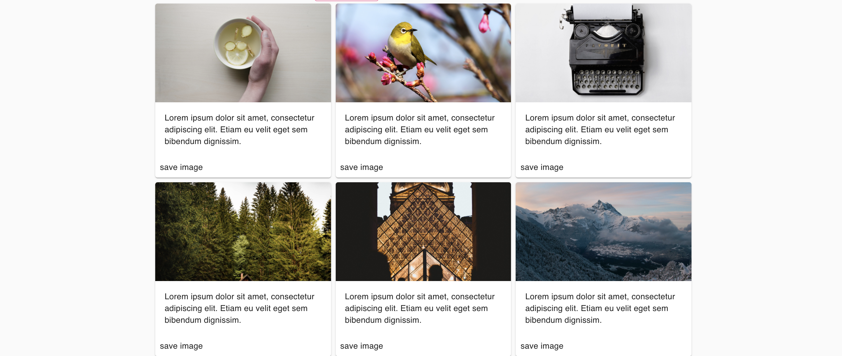
Cards
Cards are component that contains content. The card component in material-UI can also be used with other components depending on what you're trying to achieve. These components are:
- CardContent: This is where the content of the card is displayed.
- CardMedia: This is the component that holds the image in a card. It has the title props which is used to add description of the image, the image props which holds image and the component props which is used to center images.
- CardActionArea
- CardAction
- CardHeader
Demo:
const grids = [
  {
    title: "photo",
    image: "https://source.unsplash.com/collection/190727/1600x900",
    cardcontent: "Lorem ipsum dolor sit amet, consectetur adipiscing elit. Etiam eu velit eget sem bibendum dignissim.",
  },
  {
    title: "photo",
    image: "https://source.unsplash.com/collection/190726/1600x900",
    cardcontent: "Lorem ipsum dolor sit amet, consectetur adipiscing elit. Etiam eu velit eget sem bibendum dignissim.",
  },
  {
    title: "photo",
    image: "https://source.unsplash.com/collection/190725/1600x900",
    cardcontent: "Lorem ipsum dolor sit amet, consectetur adipiscing elit. Etiam eu velit eget sem bibendum dignissim.",
  },
  {
    title: "photo",
    image: "https://source.unsplash.com/collection/190735/1600x900",
    cardcontent: "Lorem ipsum dolor sit amet, consectetur adipiscing elit. Etiam eu velit eget sem bibendum dignissim.",
  },
  {
    title: "photo",
    image: "https://source.unsplash.com/collection/190736/1600x900",
    cardcontent: "Lorem ipsum dolor sit amet, consectetur adipiscing elit. Etiam eu velit eget sem bibendum dignissim.",
  },
  {
    title: "photo",
    image: "https://source.unsplash.com/collection/190777/1600x900",
    cardcontent: "Lorem ipsum dolor sit amet, consectetur adipiscing elit. Etiam eu velit eget sem bibendum dignissim.",
  },
];
function Cards(){
return(
<Container maxWidth="lg">
<Grid container spacing={1} >
        {grids.map(({ title, image, cardaction }) => (
          <Grid item key={image} xs={12} md={4}>
            <Card>
              <CardMedia title={title} image={image} component="img" />
              <CardContent>{cardaction}</CardContent>
              <CardActions>
								<Button>
									save image
								</Button>
							</CardActions>
            </Card>
          </Grid>
        ))}
      </Grid>
</Container>
)
}
Typography
The typography component is used to display text in material UI.
<Typography variant="h1" color="primary">Hello world!</Typography>
The Variant props can be used to display text in different forms. It has values such as h1, h2, h3, h4, h5, h6, body1, body2, subtitle1, subtitle2, button. The color props can be customized.
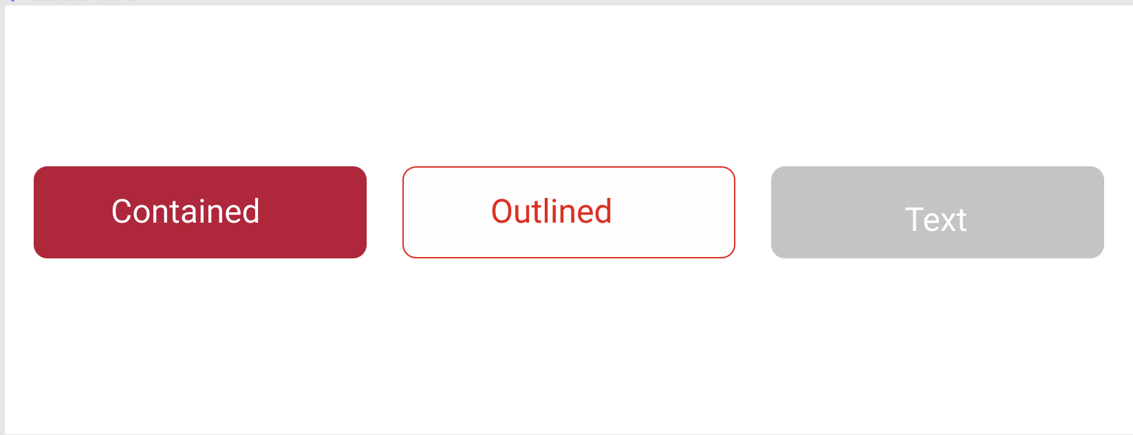
Button
Buttons allow users to take actions, and make choices, with a single tap. Material UI button component has the variant prop which takes in different values that allows the button to be displayed in different formats.
Buttons in material UI can be implemented using the code below:
<Button variant="contained" color="secondary">
<Button variant="outlined" color="secondary">
<Button variant="text" color="default">
AppBar
The App Bar or header displays information and actions relating to the current screen. It has the position props which take in value such as "static", "fixed", "sticky", "relative", "absolute". In order to use the Appbar, you'll need other components with it.
Demo:
import AppBar from '@material-ui/core/AppBar'
import Toolbar from '@material-ui/core/Toolbar'
import Typography from '@material-ui/core/Typography'
import CameraAltIcon from '@material-ui/icons/CameraAlt';

function Header(){
  return(
    <AppBar position="static" color="secondary">
      <Toolbar>
        <Typography variant="h6">
          PhotoCollage
        </Typography>
        <CameraAltIcon/>
      </Toolbar>
    </AppBar>
  )
}

These are the basic components you need to know in order to get started with using material-UI. In the coming series, other features of Material UI will be covered .
You can find a full demo of this tutorial on my CodeSandbox
WorksHub
Jobs
Locations
Articles
Ground Floor, Verse Building, 18 Brunswick Place, London, N1 6DZ
108 E 16th Street, New York, NY 10003
Subscribe to our newsletter
Join over 111,000 others and get access to exclusive content, job opportunities and more!